Overview
Underwater Inspection Services wanted something that felt solid, trustworthy, and clearly tied to the marine industry. The company does technical, often safety-critical work, so the branding needed to reflect that seriousness, without losing character or visual interest. I wanted something that nodded to the roots of underwater work while also feeling clean and modern for use across today’s digital and print platforms.


Design
Iconography:
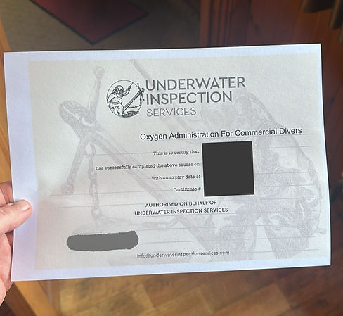
The hand-drawn diver was a central piece from the start. The traditional deep-sea diving suit represents the heritage of underwater inspection, and there’s something iconic and instantly recognizable about that old-school gear. Paired with the anchor, it really grounds the logo in the marine space.
The diver isn’t just there for style, it communicates that there’s a real person behind the work, someone physically inspecting, diving, getting into those hard-to-reach places. The circle surrounding the illustration is a simple way to frame the scene, but it also subtly brings in a bit of narrative.
Style & Aesthetic:
I leaned into a black-and-white palette for maximum clarity and adaptability. It works across everything from invoices to uniforms to vessel decals without needing extra colours or gradients. The illustration was hand-drawn, which brings warmth and a touch of craftsmanship to reflect the care and precision required in underwater inspections.
I kept the overall layout minimal and balanced. The strong lines of the text offset the more organic lines of the illustration nicely. Everything is spaced so it’s easy to read and visually digest in a split second, whether it’s on a business card or the side of a work van.
Typography:
For the main text ("UNDERWATER INSPECTION"), I picked a bold geometric sans-serif. It’s clean, strong, and dependable, exactly the tone I wanted. It gives the logo weight and stability, and because it's a geometric font, it aligns well with the technical nature of the work.
"Services" underneath is set in a much lighter weight, still sans-serif, but with more spacing. That gives it a nice contrast and keeps the focus on the main title while still clearly presenting the full business name. It’s a subtle way to add hierarchy without needing extra visual clutter.
Influences:
The biggest influence was definitely maritime history and traditional diving gear. I also looked at old naval illustrations and vintage marine equipment drawings, there’s a timelessness there that I wanted to capture. On the flip side, I made sure to balance that with modern typography and a contemporary layout, so it feels relevant in today’s branding world.
Others:
This logo was built to be flexible, it works in black and white, scales well for different uses, and stays legible in small sizes. It’s got a bit of personality without being over-designed. That balance was key for me: something that feels both handcrafted and professional, technical and approachable.